Swift is the smartcard that enables simple and seamless travel across different modes of public transport in the West Midlands, similar to the Oyster card in Greater London.
The original Swift logo was designed in 2012. It was a complex design which proved difficult to implement across a wide range of media channels, which were also never considered at the time of it's creation. The Swift team had the opportunity to introduce a new logo that considers it's use in growing digital platforms. They required a new logo that linked to innovation and the meaning behind the name Swift through the idea of the bird, speed and movement.
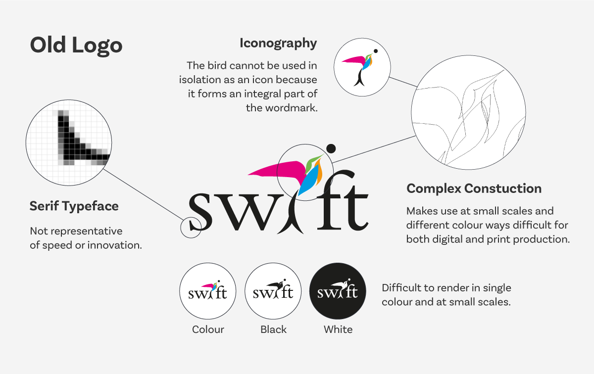
Old Logo - Highlighted problems that needed to be addressed in the new identity.

Idea - Using a combination of simple shapes to create a unique icon.
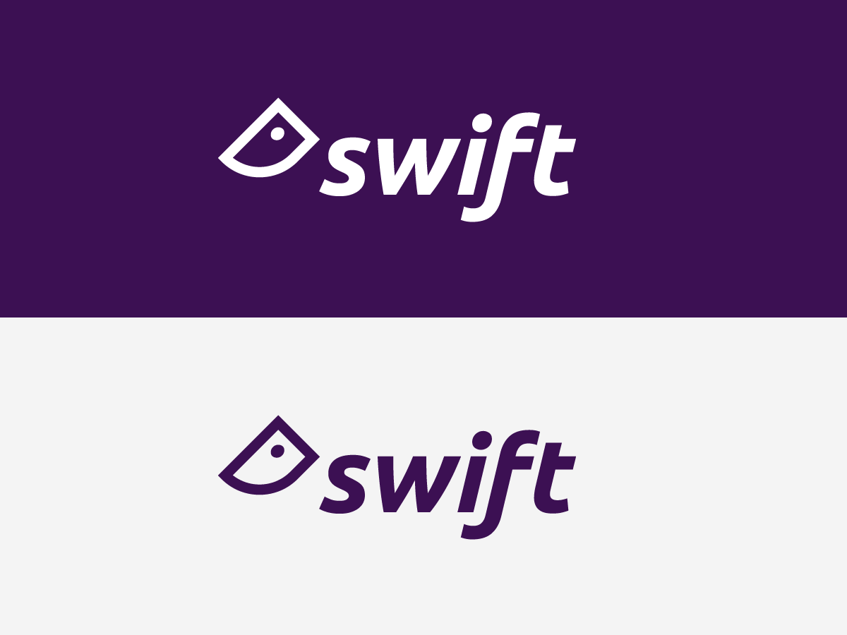
New Logo - In white and a new primary colour.
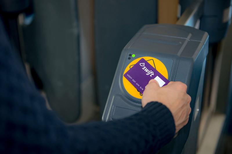
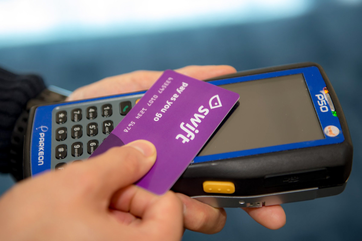
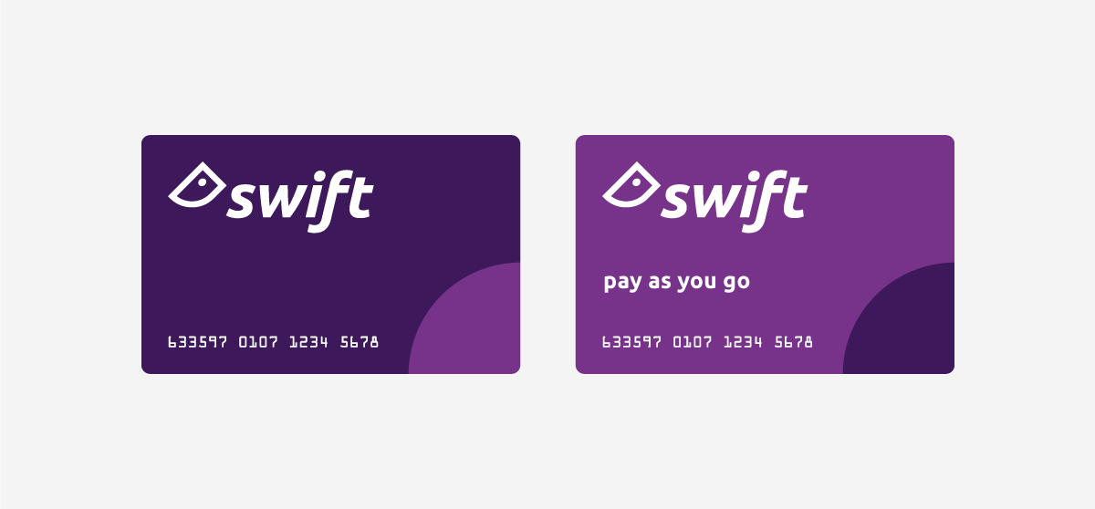
Smart Card - Swift payment card designs.

App Icon - Launch icons using the new mark.

Polo Shirt - Branding applied to clothing.